-
PLS Chainstitcher Script
Regular price $39.00 USDRegular price -
PLS Draftsmen
Regular price $39.00 USDRegular price


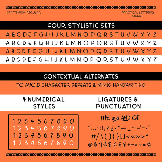

Vintage Style Monoline Fonts
Fonts that feature uniform stroke width throughout each letterform inspired by early lettering books, showcards, and drafting pen instructionals. Great for poster layouts, labels, patches, and small headlines where simplicity and legibility matter.
Tips for use
-
Mind letter-spacing: add ~2–4% tracking at small sizes to keep counters open; you can tighten slightly at large display sizes.
- Don’t fake weight: choose a heavier style instead of faux bold or outline effects.
- Keep effects minimal: heavy outlines, shadows, or distortions fight the even stroke, use scale and color for emphasis.
- Pair simply: match with a plain gothic/sans or a script.
- Limit condensing: extreme width changes break the monoline feel and can close up forms.
-
Use features when available: for monoline scripts, enable
caltand ligatures to avoid repetitive shapes.